
In the first of a series of posts, Aparna Maladkar writes about data visualisation:
A recent first of its kind, unique competition ‘Digging the Data’ (2018) held by 360Giving charity proves to be illustrative in appreciating how far data visualisation can go to understand its role in research. This challenge invited developers, students, researchers, data artists, graphic designers, data journalists, designers and analysts to analyse datasets of over 290,000 grants over multiple years, and to create visual diagrams to better understand key questions facing the grantmaking sector regarding funding, thematic areas preferred by funders, and amounts they give. The competition intended to help grantmakers, fund seekers and policy makers to make better decisions and choices, while developing a ‘bridge between the data and the public’.[1]The staggering amount of funding data was sieved to create numerous beautiful and illustrative winning entries. By using a variety of digitial tools, the results were interactive and stimulating diagrams that successfully transformed tedious data into stunning artworks easy to read and comprehend by all.
Data visualisation or visual research can be a useful and powerful tool. The ‘Draw’ Your Own Conclusions (DYOC) Blog-Series will consider some key questions for data visualisation including what are the added benefits of a drawn word in research; how successfully has it been applied; are specialised qualifications or tools necessary to become a data visualisation expert. The DYOC Series will aim to answer these questions by looking at the history of visual research, some successful as well as failed case studies, its usefulness, the powerful emotions and impacts they convey, and the approach and tools necessary to create effective diagrams.
CENDEP is focused on bringing together a diverse audience including academics, development practitioners, stakeholders and policy makers to develop its research themes related to disaster risk reduction and response, shelter, housing and home, human rights, forced migration, conflict, peace and humanitarianism, and, transformative and community resilience in adverse settings. With a variety of data and evidence available through its research activities, it becomes imperative that the diverse audience is able to appreciate and comprehend the several sets and types of data and its outcomes to ensure effective collaboration and coordination between them. The vast amount of knowledge collated as research data and analysis, if disseminated through visual means that can be appreciated by all, is likely to improve obstacles sometimes produced due to communicational, educational, regional, social and cultural barriers.
The first blog in the DYOC series will consider how to commence with the process of data visualisation before you start creating a visual image. It will be followed by analysing some successful historical case studies and its impact as data storytelling. Edgar Degas famously said that ‘Drawing is not what one sees but what one can make others see.’ It is said that a picture is worth a thousand words, and in terms of research, this literally is translated as a picture is worth 365 words. That equates to almost a whole A4 page of reading substituted by one well-drawn diagram!
Beginning the process of data visualisation: 4Ws-Diagram tool
I have been doodling[2] since I was a student of architecture, but it was when I was writing my master’s dissertation[3] that I truly appreciated the power of doodling and making research diagrams. Doodling was my main tool for research that I used extensively to illustrate field data, literature and contextual data, conceptual theories, analyses and findings through figures, doodles, mind maps, timelines, photomontages and murals! I realised that the most effective way to decide on when and how to create a visual image depends on the four main points discussed below.

Based on my doodling experiences, I have designed the ‘Four W’s of Visual Research’ (4-Ws) diagram tool. The 4-Ws diagram will be used to analyse the impacts of case studies discussed in this series, and to better understand the need and process for creating visual data. The tool considers four main questions that can assist in creating impactful and effective outcomes:
· When to use visual graphics? What research inputs do you need to visualise data: complexity, comparative data, impacts?
· What to consider to create visual data? What tools to use? What is the process and what are the activities?
· Who is the audience for visual data? What type of target audience needs to understand the complex data?
· Why use visual graphics? What is the impact you trying to achieve with the visual graphics?
Answering these questions before creating every diagram can prove to be crucial for the success of the diagram.
Historical data

William Playfair, a Scottish engineer and inventor who enjoyed visual presentations, is known as the ‘Grand Daddy’ of data visualisation, and is said to have published the first ever pie-chart. In 1786, using graphics such as line, area and bar graphs and later pie charts, his impressive diagrams became famous for showing comparisons of England’s imports and exports from 1700 to 1782.[4] Having to use the humble quill to create his diagrams, to improve clarity, his graphs were adorned with clear labels, numerics, callouts, guidelines and title blocks.[5]
The Rose Diagram

One of the most well-known visual research diagrams is Florence Nightingale’s Rose Diagram[6] created 160 years ago. While caring for soldiers during the Crimean War, Nightingale along with her staff of 38 women nurses, kept a detailed account of deaths of British soldiers from 1854-56. Much of her original report was not published because it was considered controversial, however, the revolutionary and pioneering Rose Diagram[7] was published hidden away in the appendix of the Royal Commission report.
What makes the Rose Diagram a success?
To understand the reasons for creation and impact of the Rose Diagram, we will analyse it using the 4Ws diagram. The tool shows that the complex data of the Rose Diagram tells a compelling story of war and causalities, and its impact on human health. Its message ‘hospitals can kill’ was potent and direct, stating why soldiers had died in large numbers during the Crimean War.

Frankly, if the diagram above is clear, you can skip reading the written analysis below!
WHEN: The diagram was created post war to understand the large amount of meticulous data collated on mortality rates during the Crimean War. Additionally, in spite of the large number of deaths, Nightingale came to realise that the decision and policy makers seemed uninterested in thoroughly understanding the reasons behind the high mortality rates, where 16,000 out of 18,000 deaths had been due to infectious diseases in the hospital rather than battle wounds.
WHAT: Being a superb statistician herself, it is said that Nightingale took inspiration from the simplicity of the early pie-charts produced by Playfair. The diagram hopes to understand the effect and causes of the high numbers of deaths, and further compare the results over a two-year period. The simple yet eye catching and beautiful diagram that looks like a large swathe of blue rose petals reveals the terrible truth of horrific death toll, and importantly, identifies the crucial reason for the staggering numbers of deaths from dysentery and typhus type of infectious diseases that could have been easily prevented. Post June 1856, cholera experts and sanitary engineers arrived on field, and sanitation conditions and hygiene practices improved lowering the reported cases of deaths and giving soldiers a better chance of survival.
WHO: When authorities tried to find faults with the Rose diagram, Nightingale leaked it to 100 influential individuals across different fields. The public outcry had a tremendous impact on the authorities. A radical reform was only possible because the results were better and easily grasped by the public, decision makers and medical practitioners. The target audience, the British Army and the British government were forced to set up an enquiry to improve their understanding of the impacts of conflict and health, and the medical sector acknowledged the need for hygienic hospitals.
WHY: The fascinating feature was that the Rose diagram revealed that if right improvements were made in the hospitals, mass deaths could be avoided. It completely changed British Army’s attitude towards medical care and, as a consequence, its impact was seen on civilian hospitals too, which also improved. Following consequential changes to hospital practices, the Nightingale Training School for Nurses was established in London in 1860. The most crucial impact was that the simple, clear and visually effective diagram carried a message of hope and change, and went on to save millions of lives.
Continuing Impacts of historical case studies
Even today, the Rose diagram has a tremendous impact in understanding and visualising conflict related issues. Just recently Tangent, a graphics design studio, influenced by the Rose diagram, created a similar diagram for the conflict in Afghanistan to show deaths and causes over a number of years[8].
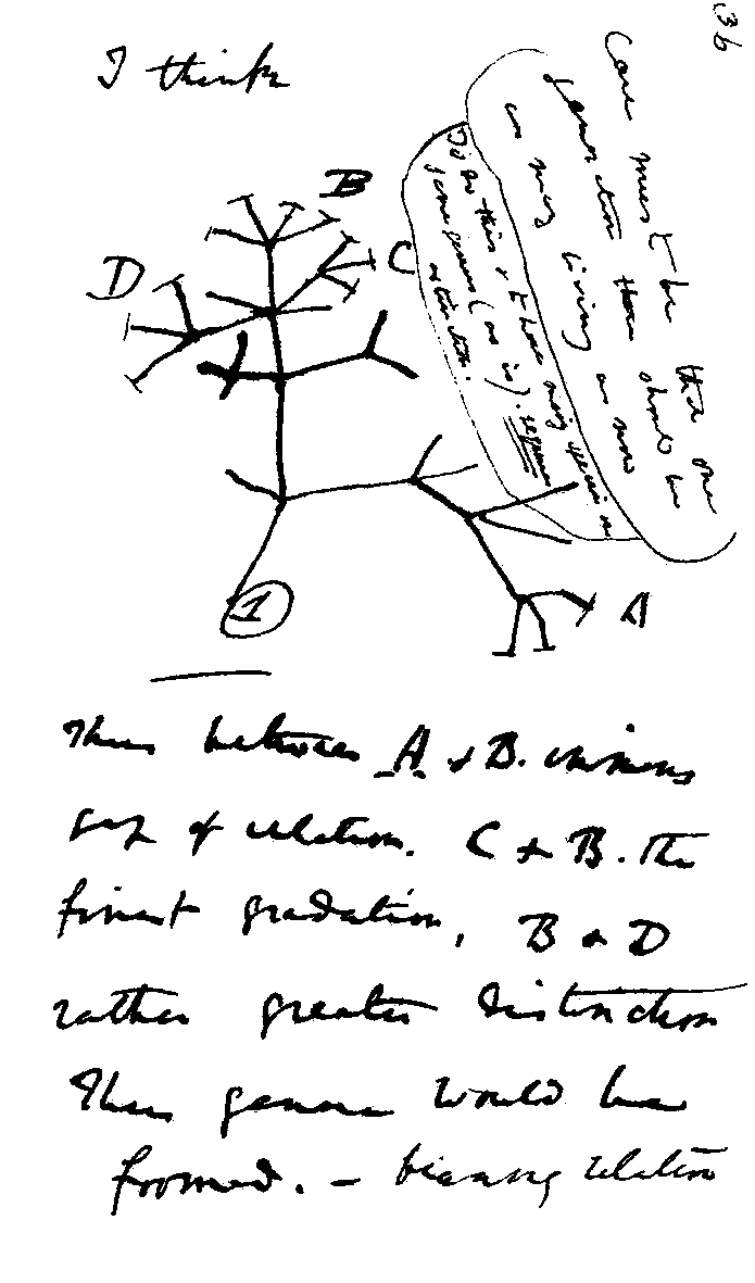
History is littered with research diagrams that have influenced generations and enforced necessary changes: the geocentric Ptolemaic System illustrating the Greek view of the Earth; the Porphyrian Tree , one of the first tree diagrams that displays levels of knowledge; Leonardo da Vinci’s Vitruvian Man that depicts human body proportions to understand theories of proportion in art and architecture; Nicolaus Copernicus’ simple yet controversial Heliocentric Universe where he placed the Sun at the centre of the Universe; Charles Darwin’s radical Evolutionary Tree; Dmitri Mendeleev’s Periodic Table classifying elements; Francis Galton’s first Weather Map; John Venn’s Venn Diagrams comparing differences and similarities; the Pioneer Plaque that conveys vital information about the human race.[9]
History illustrates that data that is usually complex and of different types, has a story to tell, and if represented in simple, clear and visually enticing diagrams, has the ability to acknowledge crucial changes, and will guarantee that its message is carried across to the target audience.
Next
In the following DYOC Series, we will analyse:
#2: ‘WHEN’ (4-Ws diagram)
#3: ‘WHAT’ (4-Ws diagram)
#4: ‘WHO’ (4-Ws diagram)
#5: ‘WHY’ (4-Ws diagram)
#6: Words that end in diagrams
[1] Peters, J., 2018. Revealing the Bigger Picture - 360Giving. [online] 360Giving. Available at: <https://www.threesixtygiving.org/2018/09/21/revealing-the-bigger-picture/> [Accessed 7 December 2020].
[2] Doodles are rough drawings or sketches typically based on available data
[3] Maladkar, A., 2017. Understanding the Role of Murals in Conflict, Occupation and Forced Displacement: Arterial Walls of West Bank. Master of Arts. Oxford Brookes University.
[4] As part of Playfair’s ‘trade-balance’ time-series charts.
[5] Tufte, E., 2001. The Visual Display of Quantitative Information. 2nd ed. Graphics Press.
[6] The Beauty of Diagrams: Florence Nightingale. 2010. [documentary] England: BBC4.
[7] Also known as the ‘Diagram of causes and mortalities in the British Army’ part of Nightingale’s report ‘Notes on Matters affecting the health, efficiency and hospital administration of the British army.
[8] Tangent | Creative & Design Agency | Glasgow. n.d. BBC4: The Beauty Of Diagrams. [online] Available at: <https://tangentgraphic.co.uk/journal/bbc4-the-beauty-of-diagrams> [Accessed 7 December 2020].
[9] Christianson, S., 2014. 100 Diagrams That Changed the World. London: Batsford.




No comments:
Post a Comment